OAC · Oracle Analytics
What changed? Exploring variance with a custom Oracle Analytics visualisation
Combine a custom variance visualisation with Oracle Analytics parameters and dashboard filters to explore the same change by region, country, product and sales channel.
Sales have increased by 6.5%. That is a useful headline, but it usually prompts another question: where did the increase come from?
Was it concentrated in one region? Did a particular product make the difference? Were gains in one channel offset by declines elsewhere?
I built What changed?, a custom Oracle Analytics visualisation, to make those comparisons easier to explore. It takes two measures and a category, calculates the change, and ranks the categories contributing to that movement. Pairing it with a dashboard filter and a parameter lets the reader change the dimension without moving to another chart.
The result is a compact way to move from the headline number to the categories behind it.
Start with the change, then explore its composition
The example uses a synthetic sales dataset with 100 rows, two measures and nine attributes. Region, Country, Product and Sales Channel provide alternative views of the same records, alongside customer, segment, account manager, contract type and product category.
The two measures are already prepared for comparison. They do not depend on a date selector inside the extension.
| Previous Sales | Current Sales | Change | Change % |
|---|---|---|---|
| 1,239,500 | 1,319,500 | +80,000 | +6.5% |
The visualisation puts those totals at the top. Beneath them, diverging bars show each category's change: increases extend to the right and decreases to the left. Ranking by absolute change brings the largest movements into view, whether positive or negative.
For Region, North contributes an increase of 53,837, while South offsets some of that gain with a decrease of 34,098. West, Central and East account for the remaining movement.
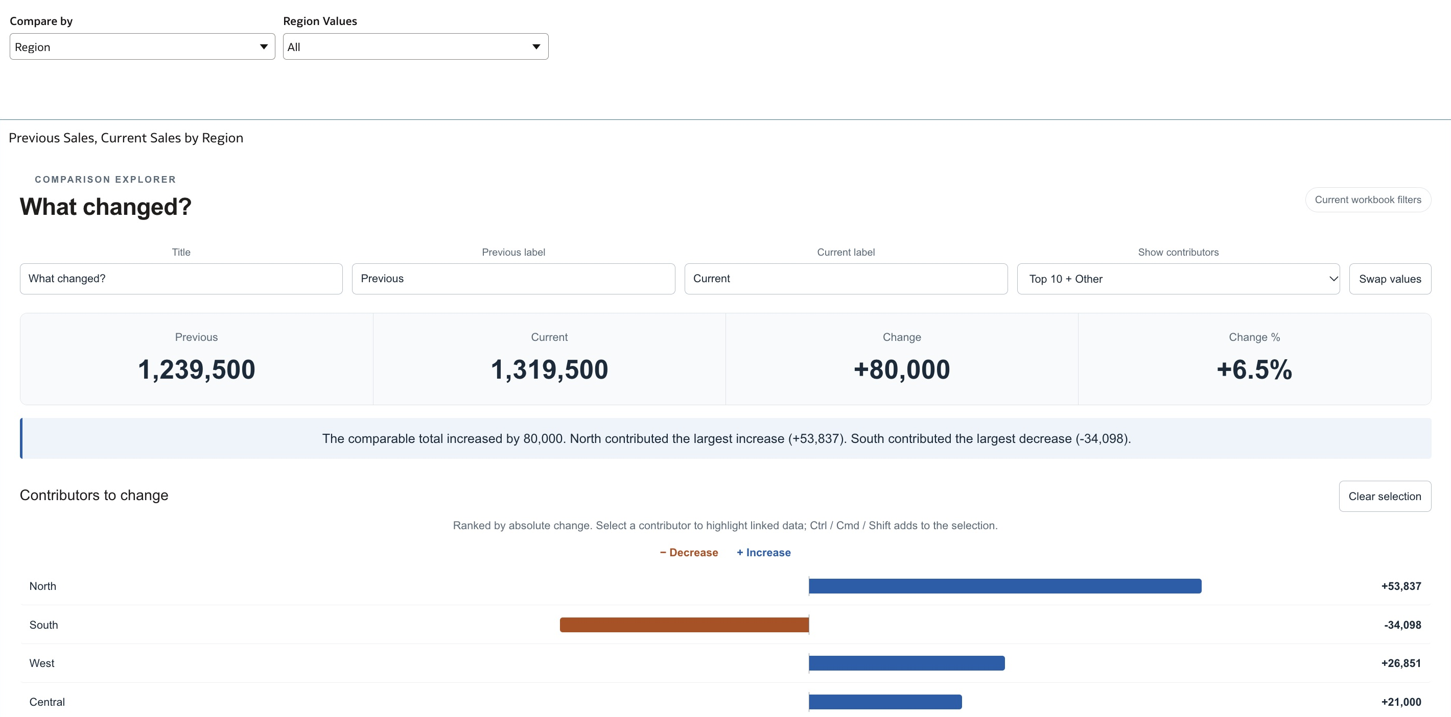
The regional view shows how positive and negative movements contribute to the overall increase. This screenshot is from the OAC workbook using the sample data.
The colours indicate direction, rather than whether a result is good or bad. An increase in revenue and an increase in costs may call for different interpretations.
One visualisation, several ways to ask the question
The Compare by control is what makes this example useful beyond a single chart. Choose Country and the visualisation groups the same measures by country. Choose Product and it changes to products. The overall total remains the same when the selection changes only the grouping.
Pairing the Compare by dimension selector with a second filter lets readers focus on specific values within the selected dimension, for example, comparing selected regions or products. The visualisation then recalculates the totals and contributions for that selection.
For example, North and South together account for an increase of 19,739 in the supplied data: North's gain of 53,837 is partly offset by South's decline of 34,098. Selecting those two regions would focus the comparison on their combined movement, rather than the full dataset's increase of 80,000.
In the sample, those views tell different parts of the numerical story:
| Compare by | Largest increase | Largest decrease |
|---|---|---|
| Region | North: +53,837 | South: −34,098 |
| Country | Netherlands: +27,764 | None; all five countries increase |
| Product | Support: +19,558 | Laptop: −9,256 |
| Sales Channel | Retail: +30,647 | Events: −6,137 |
These are alternative breakdowns of the same +80,000 change. They should not be added together: each view partitions the same sales records in a different way.
The two controls answer different questions. Selecting a dimension chooses how to group the data; selecting values chooses which data to include. Clear the values filter to return to the full comparison, and check its selection when moving to another dimension.
The workbook also uses parameter-driven naming, so its visual title follows the selected dimension. That makes it easier to see what the current comparison represents.
How the selector works
There are three parts to the setup: a text parameter, a calculated dimension, and a Dashboard Filters visualisation. This follows Oracle's documented dimension-selector pattern.
Create a text parameter named Compare by with these available values:
Region, Country, Product, Sales Channel, Customer Segment, Account Manager, Contract Type and Product Category.
Set its initial value to Region. Then create a calculation named Selected Dimension:
CASE @parameter("Compare by")('Region')
  WHEN 'Region' THEN "Region"
  WHEN 'Country' THEN "Country"
  WHEN 'Product' THEN "Product"
  WHEN 'Sales Channel' THEN "Sales Channel"
  WHEN 'Customer Segment' THEN "Customer Segment"
  WHEN 'Account Manager' THEN "Account Manager"
  WHEN 'Contract Type' THEN "Contract Type"
  WHEN 'Product Category' THEN "Product Category"
  ELSE "Region"
END
Use the editor's data-element picker to insert the column references. Depending on the dataset, Oracle Analytics may qualify them with the dataset name. The quoted WHEN strings must match the parameter values exactly.
Add a Dashboard Filters visualisation above the comparison. Drag Compare by from the Parameters pane into its Filter Controls assignment. Add Selected Dimension from the Data pane as a second control to let readers choose the category values to include. Both controls use the same calculated dimension selection, so the values control can follow the chosen perspective.
In What changed?, use these assignments:
| Assignment | Data element |
|---|---|
| Breakdown | Selected Dimension |
| Values, first position | Previous Sales |
| Values, second position | Current Sales |
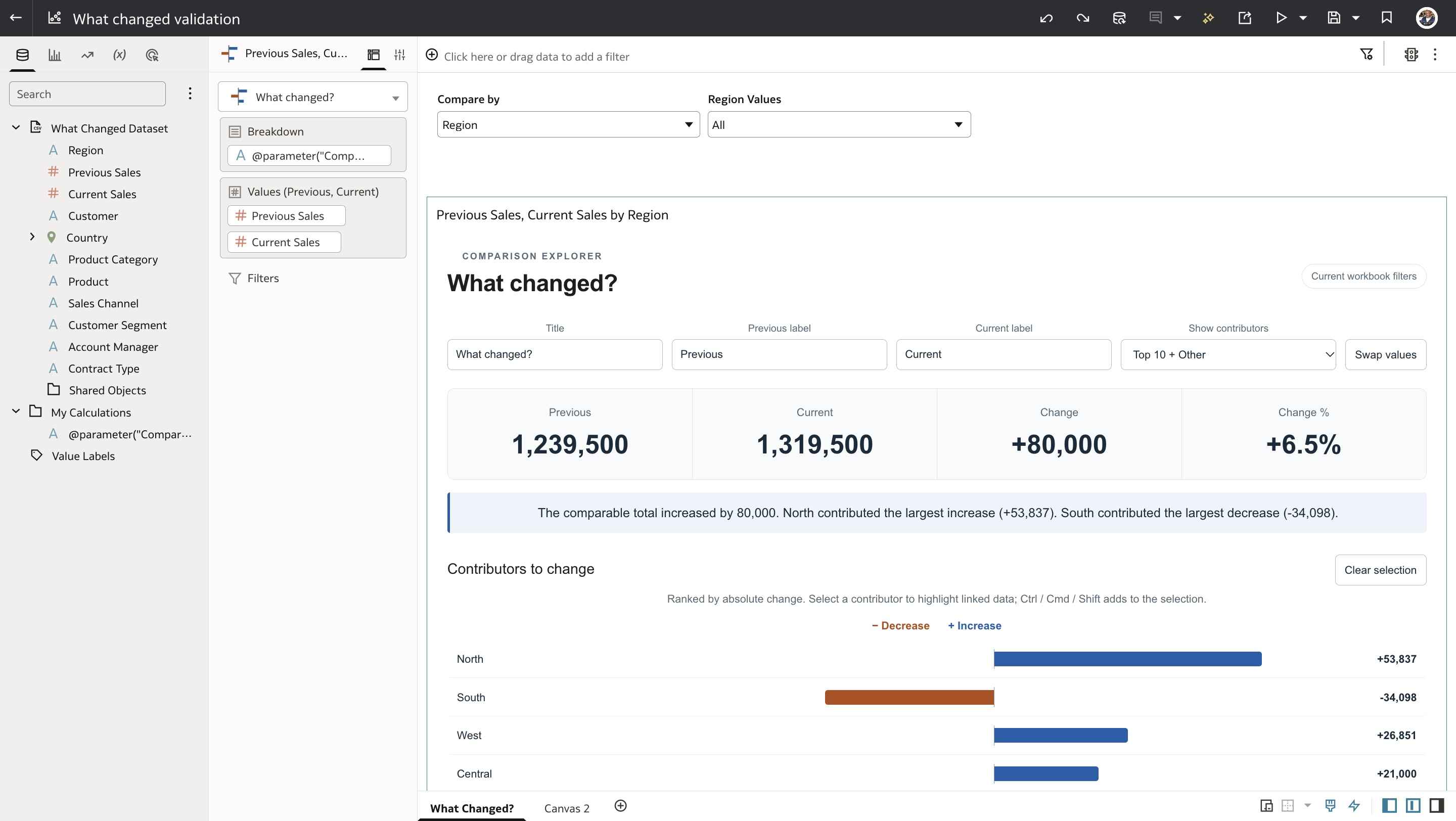
The authoring view shows the calculated dimension in Breakdown and the two measures in their comparison order. In this workbook, the calculated dimension uses a parameter expression as its display name.
The extension receives the grouped data from Oracle Analytics. Its job is to calculate and present the comparison; the parameter and calculation provide the dimension selection.
Trying the extension
The download bundle includes What changed? version 1.0.1 and the updated Sales Changes.csv. This is a community preview, rather than an Oracle-supplied or Oracle-supported visualisation.
- In a test OAC instance, open Navigator → Console → Extensions and choose Upload Extension. Upload the complete ZIP without extracting it. Oracle describes this process in its Oracle Analytics Cloud developer guide.
- Refresh Oracle Analytics and create a dataset from the supplied CSV. Use SUM for Previous Sales and Current Sales.
- Create a workbook and add What changed?. Begin with Region as Breakdown and the measures in the order shown above.
- Confirm the totals against a standard OAC table with the same data and filters.
- Add the parameter, calculation and dashboard controls to make the breakdown selectable.
The extension can show the largest contributors with the remainder grouped into Other, or show every category. The detailed comparison provides the underlying previous, current and change values. Contributor highlighting is separate from filtering: highlighting does not recalculate the totals, whereas workbook filters do.
The short narrative is generated from calculations and sentence templates. It does not use an LLM or send the comparison to an external AI service.
What the comparison can and cannot tell us
This approach is intended for additive measures in the same units and at the same grain. Revenue, costs and units can fit that pattern. Percentages, averages, ratios and overlapping distinct counts need different treatment; summing them across categories can produce misleading results.
For a positive previous value, percentage change is calculated as (current − previous) / previous × 100. The visualisation shows N/A for a zero or negative baseline. Categories with missing or invalid comparison values are excluded from both totals and flagged, so the result covers only comparable categories.
A large contribution also does not establish a cause. North accounts for the largest regional increase in the sample, but the chart cannot explain why. Pricing, volume, product mix and customer activity require further investigation.
There are two practical issues to be aware of in this preview. Custom title, period-label and display settings have reset after save/reopen in our testing, so the saved field assignments should remain the source of comparison order. We also observed an OAC filter picker retaining old available values after replacing the CSV, even though the chart reflected the corrected regions. The filter-list refresh behaviour remains under investigation.
Those limits are worth making explicit when trying the download. The tested workbook demonstrates the core comparison and parameter-driven breakdown; it is not a claim of exhaustive compatibility across OAC releases or configurations.
A reusable pattern
The useful part of this example is the combination: a visual that makes contributions to change easy to read, and familiar Oracle Analytics controls that let the reader choose the perspective.
It brings the headline, the biggest increases and decreases, and several ways to investigate them into one workbook. The same pattern can support budget versus actual, this period versus last period, or another pair of prepared measures - as long as the comparison remains meaningful.
Try the sample, check the results against your own table, and use the selector to ask the next question.