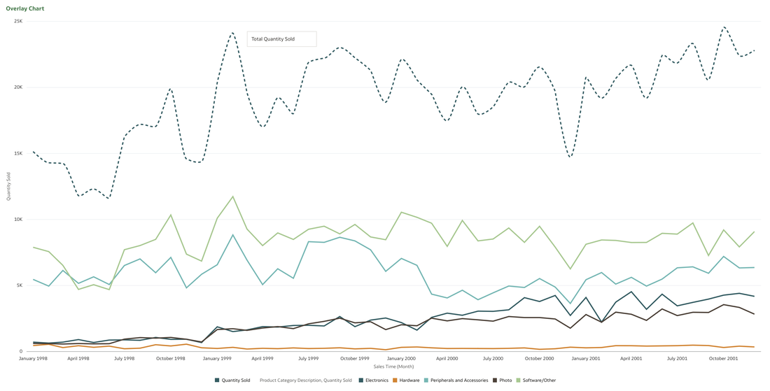
 In data visualisation, it's often desirable to present both high-level summaries and detailed breakdowns within the same view. This enables users to have a view of the bigger picture while still having access to the underlying granular data points. This seamless integration can be challenging, especially when working with disparate data sources or attempting to convey complex relationships. Fortunately, Oracle Analytics Cloud offers a powerful charting feature known as the overlay chart, which elegantly solves this problem. By combining multiple chart types into a single visualisation, the overlay chart enables you to layer summary-level metrics on top of more detailed visualisations, providing a comprehensive and cohesive view of your data. In the data panel, select the visualisations tab and then select the Overlay Chart. 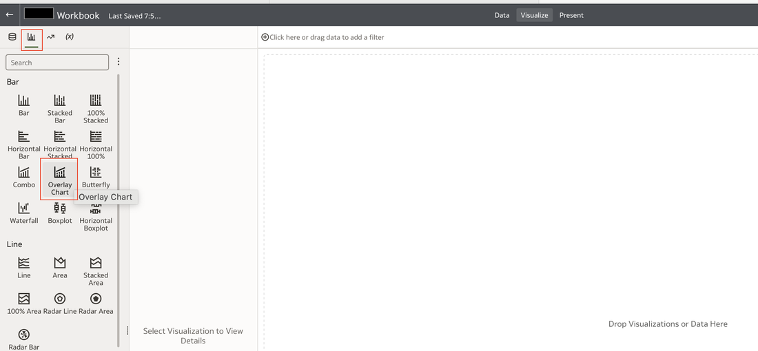 Double click or drag it into the visualise canvas. For the first layer, add the quantity sold measure to the Y axis and the Time dimension month attribute to the X axis. For the second layer, repeat the above and add the Product Category Description to the colour section. 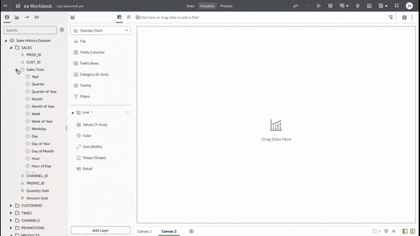 The overlay chart is a powerful data visualisation tool in Oracle Analytics Cloud that enables seamless integration of high-level metrics and granular details within a single view. By layering multiple chart types, you can construct rich, multifaceted data stories. Whether unveiling executive summaries backed by granular evidence or pinpointing critical operational insights amidst a sea of data, the overlay chart empowers you to communicate with clarity and impact. 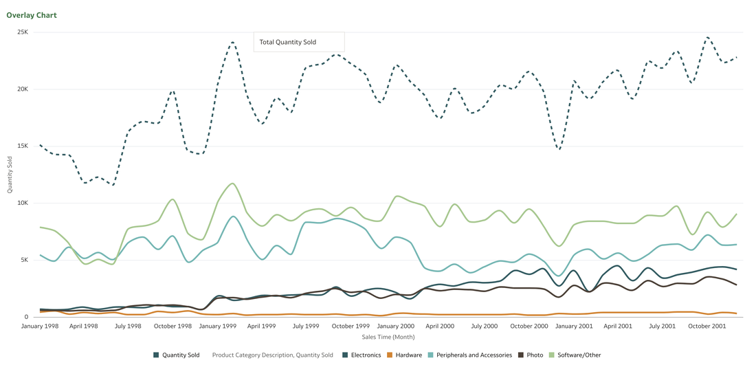 As you continue to explore the capabilities of this versatile charting technique, you'll unlock new avenues for data-driven storytelling, fostering a deeper understanding of your business landscape and driving more informed decision-making across your organisation. Embrace the overlay chart, and elevate your ability to transform raw data into compelling narratives that inspire action and drive meaningful change.
0 Comments
Your comment will be posted after it is approved.
Leave a Reply. |
AuthorA bit about me. I am an Oracle ACE Pro, Oracle Cloud Infrastructure 2023 Enterprise Analytics Professional, Oracle Cloud Fusion Analytics Warehouse 2023 Certified Implementation Professional, Oracle Cloud Platform Enterprise Analytics 2022 Certified Professional, Oracle Cloud Platform Enterprise Analytics 2019 Certified Associate and a certified OBIEE 11g implementation specialist. Archives
May 2024
Categories
|
 RSS Feed
